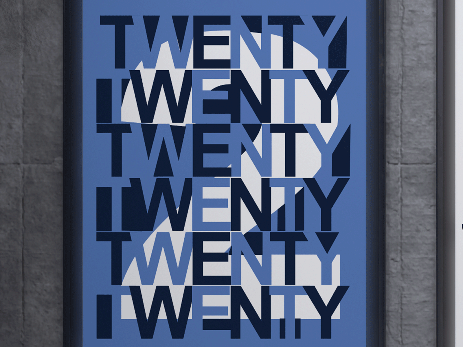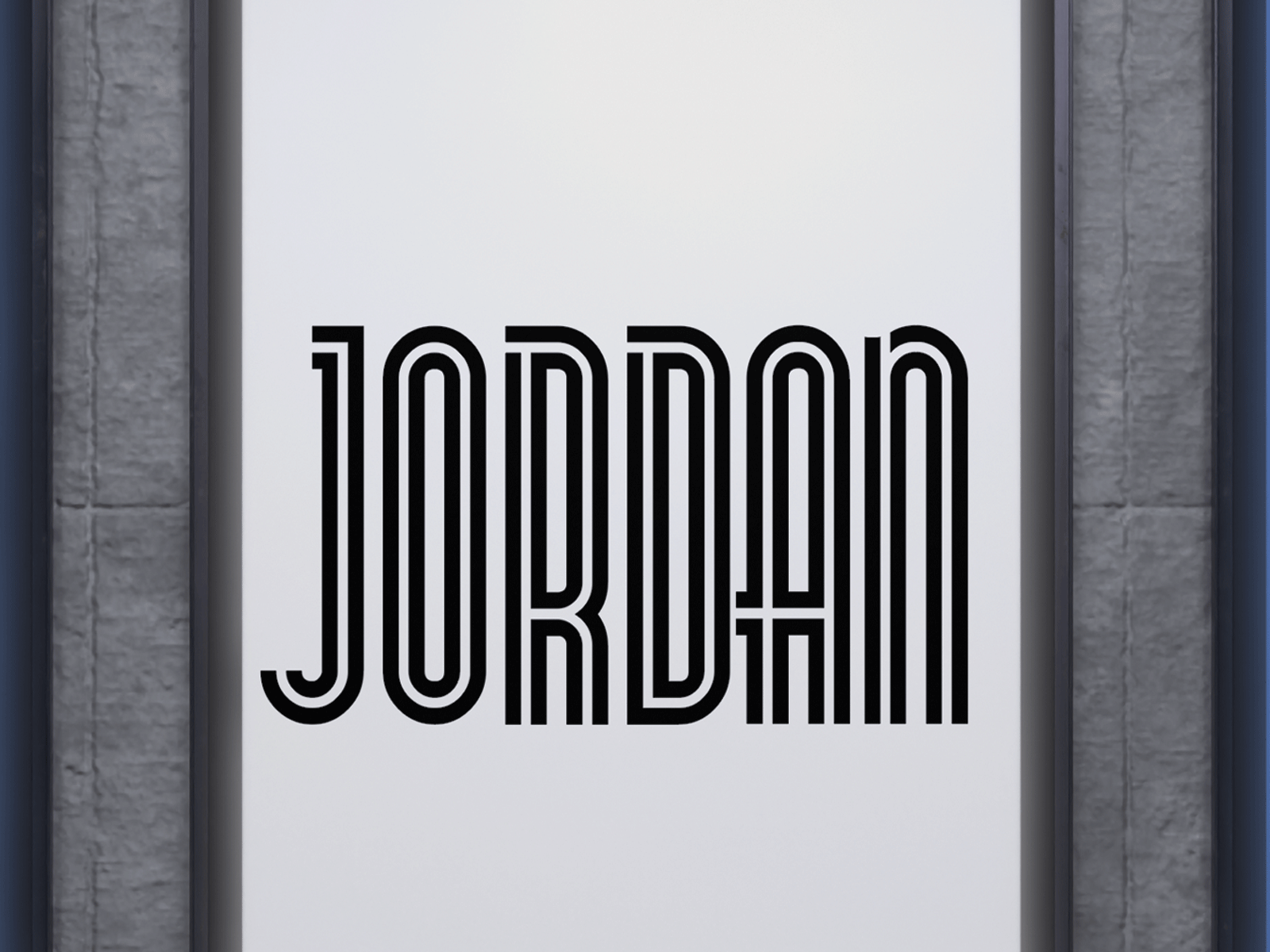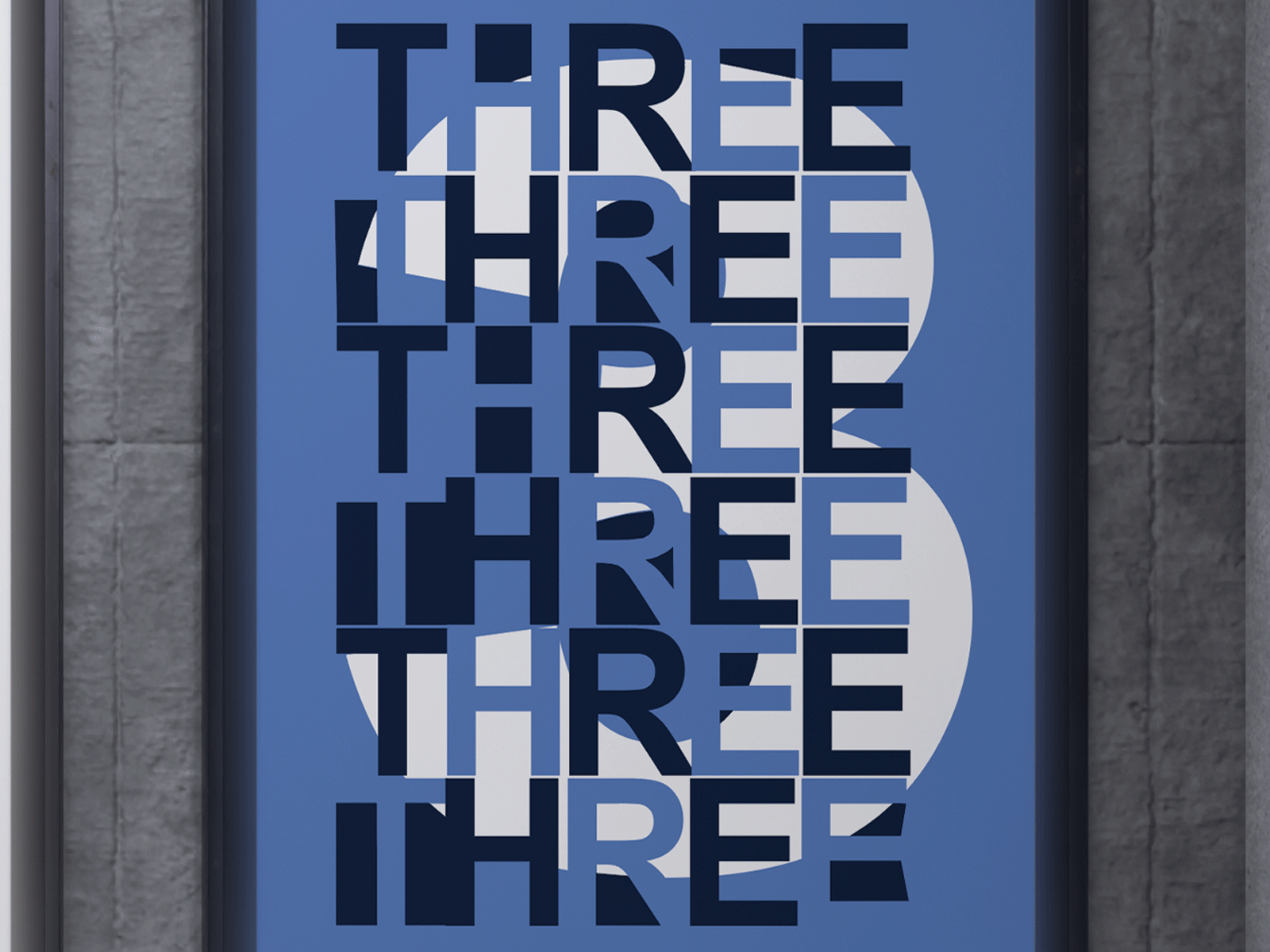
Twenty Three-
This piece of work was apart of my typography art book. The two outer panels, the “2-twenty” and the “3-three” were a part of a page spread design that used the type’s counter/negative space as the main design element. As for the center panel, this was simply the title of the entire art book at which I designed— “Jordan”. I liked the way the three pieces of work looked together as one, so that is how I displayed them for this specific portfolio piece.


These are close-up versions of my work.